Here’s a question worth sitting with: what does your AP or principal actually know about tardies at your school?
Not last week’s total. Not whether the number went up or down. What they actually know. Which students are repeating. Which periods are producing the volume. Which classrooms are outside the norm. Whether anything changed since last week.
For most admins, the honest answer is: not much. The report shows a number. The number went up or down. The week moves on.
The issue isn’t that nobody’s looking at the data. It’s that the data doesn’t show enough to act on.
What Your SIS Report Can’t Show You
Before getting into what a tardy dashboard should show, it’s worth being clear about what an SIS-only report structurally cannot show, regardless of how good the reporting tools are.
The SIS captures what gets logged. Passing-period tardies rarely get logged. A student who is late to third period because they were wandering the hallway between second and third doesn’t exist in the SIS report unless a teacher noticed, walked it to the office, and someone had time to enter it. That chain fails several times a day in most schools.
Minga captures passing-period tardies through the same automated workflow as morning tardies. The student late to third period gets logged the same way as the student late to first. The dashboard reflects what happened across the full school day, not just the window when the front desk had capacity.
“SIS captures what gets reported. Minga captures what actually happens.” The difference is in how the data gets produced, and everything that follows, the Monday morning review, the longitudinal analytics, the classroom-level patterns, is downstream of that one structural difference.
How Can Assistant Principals Quickly See Which Students Are Repeatedly Tardy or Out of Class?
In an SIS-only school, the answer is a manual report pull. Filter by student. Look for repeat names. Cross-reference with attendance records. The whole process takes longer than it should and the data is only as complete as what got manually entered.
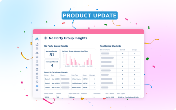
With automated tardy capture, the repeat-tardy list updates in real time. The AP opens the dashboard and sees which students have crossed a threshold this week, this month, or this semester. Not as a batch report at the end of the day. As a live view that reflects what happened in every passing period.
A student who is late to third period three times in a week shows up in Minga’s dashboard that week. In an SIS-only school, she might show up in a report two weeks later, if the third-period tardies got entered at all.
Minga’s Tardy Management surfaces repeat-tardy students automatically. When a student crosses the threshold the school has set, the system flags them. The AP doesn’t have to go looking for the pattern. The pattern comes to the AP.
At Montgomery County High School in Kentucky, Principal Holly Lawson described “a huge shift in staff involvement” once the system was in place. Teachers were actively managing tardies because they knew the data was there and someone was looking at it.
What Platforms Provide Strong Analytics Around Tardiness Improvement Over Time?
Any platform that captures tardies consistently enough to produce a reliable trend line, and that bar is higher than it sounds.
SIS-based attendance analytics reflect what got manually entered. If capture improved at the same time a new policy launched, the trend line shows improvement that is partly a data-capture change, not a behavior change. The analytics look good because the logging got better, not because students got more punctual.
Minga’s longitudinal analytics reflect what actually happens in the hallway, because the capture is automated and consistent. The trend line shows real behavior change because the denominator (total tardies captured) doesn’t shift based on how busy the front desk was.
What strong tardy analytics should show:
Week-over-week and month-over-month tardy volume. Not just the total, but the breakdown by period, by location, and by student cohort. A school-wide decrease driven entirely by one period is a different problem than one consistent across all periods.
Before-and-after views for policy changes. When a school tightens its tardy policy or adds a new consequence tier, the dashboard should show whether behavior changed and when.
Repeat-tardy trends by student. Twelve tardies in semester one and three in semester two is a success story worth knowing. Three in semester one and twelve in semester two is a student who needs a conversation this week.
For more on how automated capture makes these analytics more accurate, see What School Software Actually Reduces Tardies, Not Just Track Them.
What Tools Help Identify Which Teachers Are Struggling With Class Tardiness Issues?
This question has the fewest good answers in the market, which makes it the most defensible ground for Minga to occupy. It also requires the most careful framing.
The question isn’t “which teachers can we catch not enforcing the tardy policy.” It’s “which classrooms have patterns that suggest the school needs to do something different, whether that’s offering support, adjusting the schedule, changing the bell timing for that wing, or having a conversation about what’s driving the volume.”
Classroom-level tardy data is a diagnostic tool, not an evaluation tool.
Which classes have the highest tardy volume relative to enrollment and time of day? A third-period class of thirty students with twelve tardies per week is a different situation from a third-period class of thirty students with two. The former might reflect a teacher who needs additional support. Or a hallway bottleneck that needs a staffing adjustment. The data tells you where to look. The walkthrough with the teacher tells you why.
When an AP can see that one classroom has three times the tardy volume of comparable classes at the same period, that’s the opening. “I’m seeing some patterns in the data and I want to make sure you have what you need” lands differently than “you have a problem.”
The Monday Morning Review: What It Should Take
Three questions. Fifteen minutes. Every Monday.
Actually, scratch that framing — it sounds like a productivity hack. Here’s what it really is: the minimum useful information an AP needs before the week starts.
Which students crossed a threshold this week? Flag anyone who hit the school’s threshold for the first time. Check whether anyone on last week’s list improved or got worse. These are the conversations to have before the week fills up.
Which periods produced the most volume? If passing period two is consistently producing three times the volume of passing period four, something is happening there worth understanding. Bell timing? Building route? A classroom cluster near a bottleneck?
Are there any classroom-level patterns that need a conversation? Flag any class significantly outside the norm. Not to call out the teacher. To ask what support might help.
That’s the whole review. The rest of the week’s tardy conversations flow from what those three answers surface.
For a full walkthrough of how Minga’s automated workflow produces the data that makes this review possible, see How to Automate Your School’s Tardy Workflow.
If your current dashboard can’t show you the right information on Monday morning, we can take you through what this should look like.
Frequently Asked Questions
- How can assistant principals quickly see which students are repeatedly tardy or out of class?
With automated tardy capture, the repeat-tardy list updates in real time rather than requiring a manual report pull. Minga surfaces students who have crossed the school’s threshold automatically. The AP doesn’t have to go looking for the pattern — the system flags it. - What platforms provide strong analytics around tardiness improvement over time?
Platforms that capture tardies consistently enough to produce a reliable trend line. SIS-based analytics reflect what got manually entered. Minga’s automated capture means the trend line reflects what actually happened, not what got logged on any given morning. - What tools help identify which teachers are struggling with class tardiness issues?
Classroom-level tardy analytics that surface which classes have the highest tardy volume relative to enrollment and time of day. Minga’s dashboard surfaces these patterns as a diagnostic signal, not an evaluation tool. The data creates an opening for a supportive conversation about what the teacher needs. - What does a good Monday morning tardy review look like?
Three questions, about fifteen minutes. Which students crossed a threshold this week? Which periods produced the most volume? Are there any classroom-level patterns that warrant a conversation? A well-configured tardy dashboard answers all three without a manual report pull. - Does Minga capture passing-period tardies, or just morning arrivals?
Both. This is a significant difference from SIS-only schools, where passing-period tardies rarely get logged. The patterns Minga surfaces across the full school day literally cannot appear in an SIS-only report.